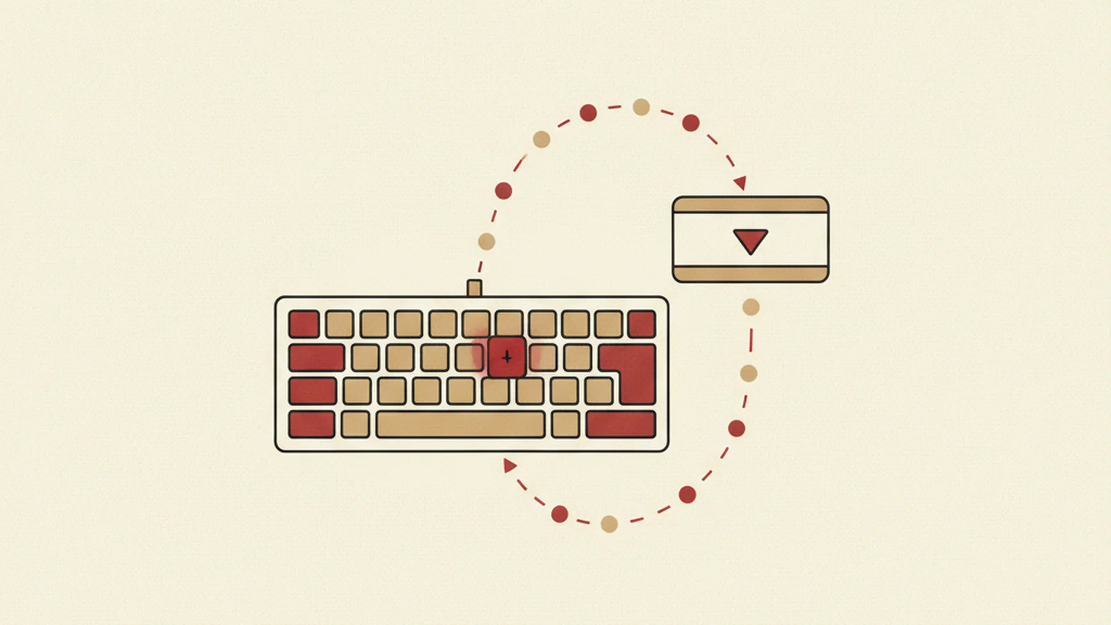
A designer ships a gorgeous custom dropdown. It has the right shadows, a smooth open animation, and it feels great under a mouse. QA signs off. Design signs off. Then a keyboard-only tester sits down, hits Tab to reach it, and something breaks.
Maybe the focus ring vanishes into thin air the moment the menu opens. Maybe Tab skips clean over the whole widget like it isn't there. Maybe the arrow keys do nothing, so the only way to pick an option is to abandon the keyboard and grab a mouse, which defeats the entire point of testing it in the first place. The component works. It just doesn't work for everyone, and it fails at the most basic level a component can fail.
The Stat: WCAG 2.1.1 (Keyboard) is a Level A success criterion, meaning a component that cannot be operated by keyboard alone fails the most basic conformance level there is, not an advanced one. (Source: W3C WCAG 2.2)
If you already know the basics, tab order, visible focus, not trapping the cursor, you've likely read our piece on keyboard navigation and visible focus. That article covers the ground floor. This one is the floor above it: the exact key bindings, the roving tabindex pattern, and the ARIA state you need for the four custom components that break the most often, dropdowns, tabs, sliders, and modals.
Why Custom Components Break Keyboard Support By Default
Native HTML elements come with keyboard behavior built in. A real <select> already knows what arrow keys do. A real <button> already responds to Enter and Space. The moment you build a "select" or a "button" out of <div> elements to get a specific visual look, all of that free behavior disappears. You have to write it yourself, and the browser will not remind you when you forget.
That is the entire story behind most broken custom widgets. Nobody removed the keyboard support on purpose. It was never there to begin with, because a <div> has no opinion about what the arrow key should do.
The Two Concepts That Fix Almost Everything
Before the component-by-component breakdown, two concepts do most of the heavy lifting.
Roving tabindex. Instead of every item inside a widget being individually reachable by Tab, only one item in the group holds tabindex="0" at a time. Every other item in that group gets tabindex="-1". Tab moves focus into the group once and out of the group once. Once focus is inside, the arrow keys move it between items, and your script updates which item holds tabindex="0" as it goes. This is what makes a set of tabs or a dropdown list feel like one stop on the page instead of ten.
ARIA state that matches reality. A dropdown that is visually open but still says aria-expanded="false" is lying to assistive technology. The state attribute has to flip the instant the visual state flips, not on a delay, not only on mouse events. The same goes for aria-selected on a tab, aria-checked on a custom checkbox, and aria-valuenow on a slider.
Both of these concepts, along with the full expected behavior for every common widget type, are documented in the W3C ARIA Authoring Practices Guide, which is the closest thing the web has to an official rulebook for this. It is worth bookmarking.
Dropdown (Listbox / Combobox)
A custom dropdown menu is really two things: a button that opens it, and a list that behaves like a <select> once it's open.
- Tab moves focus to the trigger button, and later moves focus out of the whole widget once it's closed. It never leaves focus stranded inside an open list.
- Enter or Space on the trigger opens the list and moves focus to the currently selected item, or the first item if nothing is selected yet.
- Arrow Down / Arrow Up move focus between options using the roving tabindex pattern described above, wrapping or stopping at the ends depending on the pattern you choose.
- Enter on a highlighted option selects it, closes the list, and returns focus to the trigger button.
- Escape closes the list without changing the selection and returns focus to the trigger button.
On the state side: the trigger needs aria-haspopup="listbox" and aria-expanded that flips true/false with the actual open state. The currently highlighted option needs aria-selected="true", and only one option should carry that at a time.
Tabs
Tabs are one of the easiest widgets to get half right, because the tab list and the tab panel are governed by different rules.
- Tab (the key) moves focus into the tab list once, landing on the currently active tab, and moves focus out to the tab panel content on the next press. It does not step through every tab one at a time.
- Arrow Left / Arrow Right move focus between individual tabs, again via roving tabindex, and depending on your chosen pattern either activate the panel immediately or wait for Enter.
- Home / End jump to the first and last tab, which matters more than it sounds like once there are more than four or five of them.
Each tab needs role="tab", each panel needs role="tabpanel", and the active tab needs aria-selected="true" while the others carry aria-selected="false". The panel is linked to its tab with aria-controls, and the tab is linked back with aria-labelledby.
Custom Slider
Sliders get rebuilt from scratch constantly for visual reasons, and they are also where teams most often forget arrow key support entirely because dragging with a mouse feels like "the whole interaction."
- Tab moves focus to the slider handle, in and then out, same as any other single-stop widget.
- Arrow Right / Arrow Up increase the value by one step; Arrow Left / Arrow Down decrease it.
- Page Up / Page Down move by a larger increment, and Home / End jump to the minimum and maximum.
The handle needs role="slider" with aria-valuemin, aria-valuemax, and aria-valuenow kept in sync on every change, plus a label via aria-label or aria-labelledby so a screen reader announces what the number actually represents.
Modal Dialog
Modals deserve their own careful treatment, and we've written a full piece on what happens when a modal traps a screen reader user instead of just trapping focus the way it's supposed to. The short version for keyboard behavior specifically:
- Tab and Shift+Tab should cycle only through elements inside the open modal, never escaping to the page behind it.
- Focus should move to the modal, usually to its heading or first interactive element, the instant it opens.
- Escape should close it and return focus to whatever triggered it in the first place, not to the top of the page.
A Simple Checklist Before You Ship
Run any custom component through this before calling it done:
- Can you reach it using only Tab, with no mouse plugged in?
- Once focus is inside, do the arrow keys (not just Tab) move between its internal parts?
- Does Escape close or cancel it, if closing or cancelling is a thing it can do?
- Does the relevant ARIA state attribute (
aria-expanded,aria-selected,aria-checked,aria-valuenow) update the instant the visual state changes? - Is focus visible at every single stop, not just some of them?
If any answer is no, that's a Level A keyboard failure sitting in production, not a nice-to-have polish item for later.
The full pattern library, including patterns beyond the four covered here like menus, trees, and grids, lives at the ARIA Authoring Practices Guide's pattern index. It's the reference we keep open in a tab while building anything custom, and it's worth the same treatment on your side.
Getting all of this right by hand, component by component, is exactly the kind of thing that's easy to get half right under a deadline. If you want a second set of eyes on the components you've already shipped, run them through our free accessibility tools and see what turns up before a user, or an auditor, finds it for you.
If you'd rather just talk to a person about a specific widget that's giving you trouble, reach our team directly at experts@wcag.world, or start with the free tools and go from there.