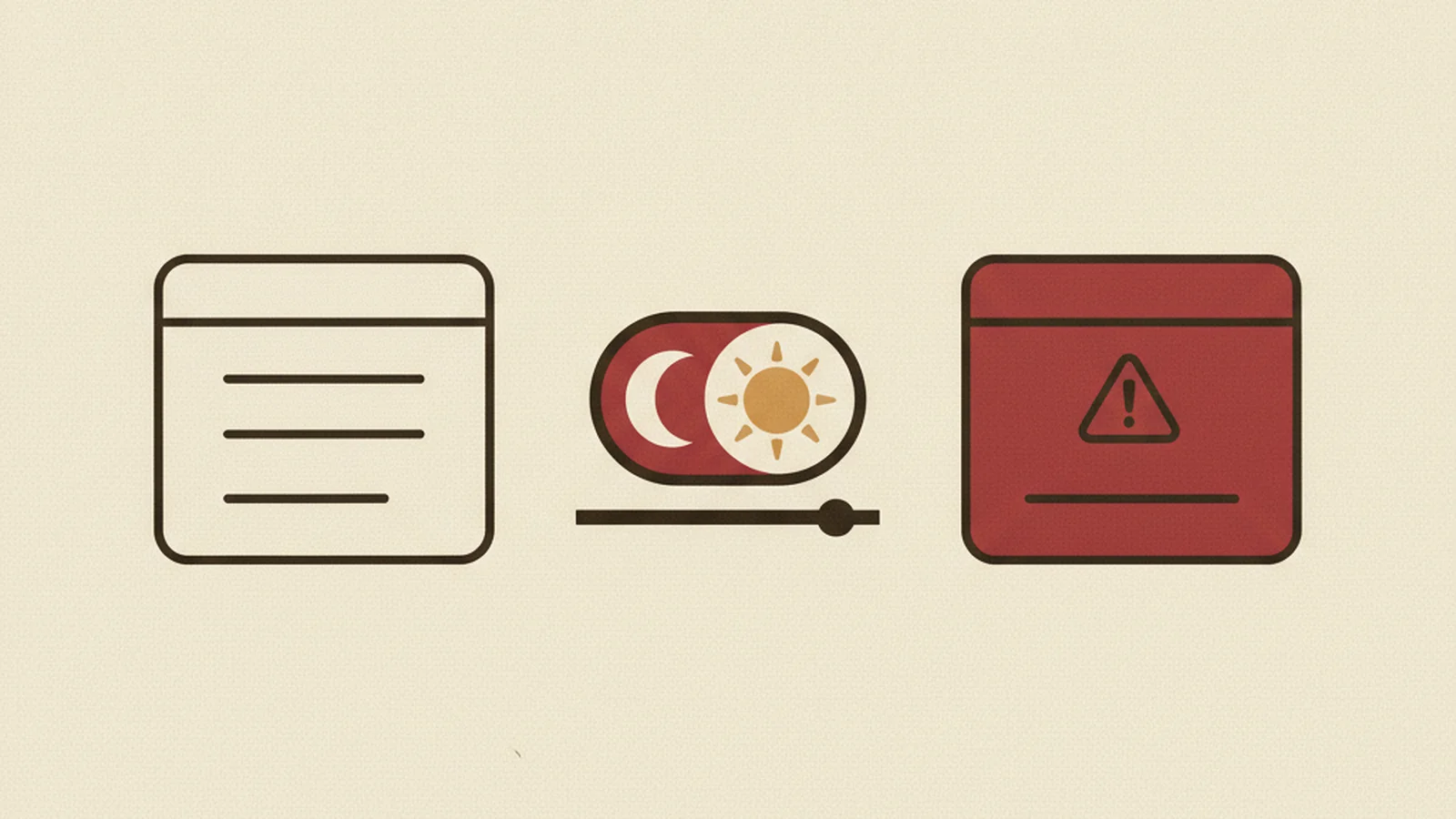
Shipping dark mode feels like a free accessibility win. It isn't. It's a second color system you now have to prove works — and most teams never actually check.
Here's the uncomfortable part: dark mode doesn't get a pass on contrast math. WCAG's requirements don't soften because the background is black instead of white. Yet teams routinely treat dark mode as a design flourish, ship it after a quick visual glance, and move on. Then an audit — or a user with low vision — finds that half the interface fails contrast in ways the light theme never did.
The Scenario Every Design Team Recognizes
Picture a product team at a mid-size SaaS company. Users have been asking for dark mode for months. The design team delivers it in a sprint, flips the primary background from white to near-black, keeps the brand blue exactly as it was, and ships.
It looks great in the demo. Nobody runs a contrast checker against the new palette before launch.
Three weeks later, a support ticket comes in: a user with low vision can't read the "Upgrade Plan" button text in dark mode, though it's perfectly legible in light mode. An internal check confirms it — the brand blue that passed comfortably against white now falls well under the required ratio against the new dark background. The button was never tested independently in its new environment.
This is not a rare story. It's the default outcome when dark mode is treated as a cosmetic inversion instead of a second design system.
Why "It Passed In Light Mode" Doesn't Transfer
The core issue is simple math, applied in a direction most teams don't think about: contrast ratio is directional, not symmetric.
Under 1.4.3 Contrast (Minimum), Level AA, normal text needs a contrast ratio of at least 4.5:1 against its background, and large text needs at least 3:1. That requirement is theme-agnostic — WCAG doesn't have a separate, looser standard for dark UI. A dark-mode palette has to earn its compliance the same way a light-mode palette does, from scratch.
Relative luminance math doesn't work the same way in both directions. A saturated brand blue or brand green that clears 4.5:1 comfortably against white frequently drops well below 4.5:1 the moment you place it against a dark background instead. The color hasn't changed — the environment around it has, and the ratio has to be recalculated, not assumed.
This is exactly the kind of failure automated cross-theme testing catches immediately and casual eyeballing misses almost every time. A designer glancing at a screen in normal room lighting will often perceive a brand-colored button as "readable enough," because human perception is a poor substitute for measured luminance contrast.
The Pure-Black Trap
There's a second, more counterintuitive failure mode: going too far in the other direction.
Pure white text (#FFFFFF) on a pure black background (#000000) technically passes contrast math with room to spare — it's about as high-contrast as two colors can get. But maximum contrast isn't automatically maximum comfort. For some users, particularly those with astigmatism or certain visual conditions, that stark white-on-black combination can cause a glare or "halation" effect that makes text physically uncomfortable to read for extended periods.
This is why many well-built accessible dark themes deliberately avoid the most extreme combination. Instead, they pair an off-white or soft gray text color with a dark gray (not pure black) background — still comfortably clearing the 4.5:1 minimum, but without the visual harshness of the starkest possible pairing. To be clear: this softer approach isn't a strict WCAG requirement. It's a practical, widely-recommended refinement on top of the requirement, worth building into your dark theme from the start rather than retrofitting later.
It's Not Just Text
Text contrast gets most of the attention, but dark mode has a quieter failure zone: everything that isn't text.
1.4.11 Non-text Contrast, Level AA requires a 3:1 contrast ratio for meaningful UI components and graphical objects — think input field borders, icon outlines, toggle states, and focus indicators. This applies in dark mode exactly as it does in light mode, and it's frequently the part teams forget entirely.
A subtle, low-contrast gray border around a form field might read perfectly fine against a white background in light mode. Flip that same border color onto a dark background without re-checking it, and it can become nearly invisible — a sighted user with low vision may not even register that a text field exists, let alone where its boundary is. Focus indicators suffer the same fate: a focus ring that's clearly visible in light mode can quietly disappear against dark backgrounds if its color and thickness weren't independently verified.
The Stat: WebAIM's annual "WebAIM Million" evaluation of the top 1,000,000 home pages has repeatedly found the vast majority — in recent years around 95-96% — have detectable WCAG 2 failures, with low-contrast text consistently among the most common. Most of those sites likely never separately verified a second, dark-mode palette. (WebAIM: The WebAIM Million)
Two Themes, Two Audits
Here's the mental model shift that fixes this at the root: if you support both a light theme and a dark theme, you are maintaining two separate color systems. Each one needs its own independent contrast audit. "We checked contrast" is only true for the theme it was actually checked against.
This is one of the most common gaps our audits surface — a site that passes cleanly in light mode, then reveals a cluster of failures the moment the same pages are re-tested in dark mode. Brand accent colors, button states, hover states, and borders are the recurring offenders.
Do This / Not This: Dark Mode Contrast Checklist
| Area | Not This | Do This |
|---|---|---|
| Brand accent colors | Reuse the exact same hex value from light mode | Re-check every brand color's ratio against the new dark background independently |
| Text-on-background | Assume high contrast is always better | Use off-white/soft gray on dark gray (not pure black) where comfort matters |
| Borders & inputs | Skip non-text elements, focus only on body text | Verify 1.4.11 Non-text Contrast (3:1) for borders, icons, and focus indicators |
| Audit process | One contrast pass, assumed to cover both themes | Two full, independent audits — one per theme |
| Timing | Check contrast after dark mode ships | Check contrast before dark mode ships |
The Real Cost of Skipping This
This isn't an edge case affecting a handful of users. The World Health Organization estimates over 1 billion people worldwide — roughly 16% of the global population — live with some form of disability (World Health Organization), and low vision or contrast sensitivity is one of the most common accessibility needs affected directly by exactly this kind of failure. In the U.S., the CDC estimates roughly 1 in 4 adults live with some type of disability (CDC).
There's also a legal dimension worth naming plainly. UsableNet's annual ADA Digital Accessibility Lawsuit Report has tracked several thousand federal ADA website lawsuits filed per year in the U.S. in recent years, alongside a growing wave of pre-suit demand letters from plaintiffs' firms (UsableNet) — and retail/ecommerce is consistently reported among the most-sued industries for web accessibility (UsableNet). A dark-mode-only contrast failure is still a contrast failure, and it's just as discoverable by an automated scanner or a demand letter as a light-mode one.
How to Actually Fix This
Treat your dark theme's contrast audit as its own independent project, not a footnote on the light-theme audit. Concretely, that means:
- Run a full 1.4.3 Contrast (Minimum) pass against the dark theme's actual rendered colors — not the light theme's colors inverted in your head.
- Pay specific attention to brand accent colors wherever they appear on a dark background: buttons, links, badges, active states.
- Check 1.4.11 Non-text Contrast for every border, icon, and focus indicator that changes color between themes.
- Consider swapping pure black and pure white for softer dark-gray/off-white pairings where extended reading comfort matters, even though it's not a strict requirement.
- Re-test after every palette change — a "small" brand color tweak in one theme can silently break compliance in the other.
Get Both Themes Actually Verified
Dark mode is a good idea. Assuming it's automatically accessible is the mistake. If your team shipped a dark theme without a dedicated contrast pass, you don't know whether it complies — you're guessing, and so is everyone auditing your site from the outside.
Get your light and dark themes both audited for contrast, with every brand color, border, and focus state checked against 1.4.3 and 1.4.11 in each theme independently. See pricing and get started.