Your Chart Is a Beautiful, Empty Box
Picture a product manager opening the quarterly report she built for the board. The animated bar chart eases in, revenue climbing quarter over quarter, a satisfying little bounce on the final bar. She's proud of it. It took the design team a week to get the motion just right.
Now picture someone using a screen reader opening that same report. The chart announces itself as "image" — or nothing at all. No numbers. No trend. No "revenue grew." Just silence where the story should be.
That's not a hypothetical edge case. It's the default behavior of almost every charting library on the market, and it's happening on dashboards right now, today, without anyone on the team realizing it.
Why Charts Fail By Default
Most charts on the web are rendered as <canvas> elements or dense, generated SVG, pumped out by libraries like the ones powering your analytics dashboard, your investor deck embed, or your SaaS product's reporting tab. Visually, that chart is rich with information — trends, comparisons, outliers, a whole narrative in pixels.
Programmatically, it's often nothing. A <canvas> element has no inherent text content for assistive technology to read. Generated SVG frequently ships without labels, titles, or structure. To a screen reader, the chart is either a blank region or a generic, unhelpful "image" — which is a direct failure of 1.1.1 Non-text Content (Level A) unless the library or the implementation has explicitly addressed it.
Here's the part that catches teams off guard: this isn't a bug in the charting library. It's the library working exactly as designed. Charting libraries are built to draw pixels fast and look impressive in a demo. Accessibility isn't the default output — it's a layer you have to build on top, deliberately, every time.
The Fix Isn't "Add Alt Text"
The instinct is to slap alt="revenue chart" on the container and move on. That satisfies nothing. A screen reader user doesn't need to know a chart exists — they need the same information the chart conveys.
A genuinely accessible chart needs a real text-equivalent path to the same data. There are two solid ways to do this, and the best implementations use both:
- An adjacent data table. The same values the chart visualizes, presented in a real HTML table — visible or visually hidden — that any assistive technology can navigate row by row. (This pairs directly with proper accessible table markup, which is its own discipline worth getting right.)
- A concise text summary of the key takeaway. Something like "Revenue grew 18% quarter over quarter, driven primarily by the Enterprise segment." One sentence. The headline a sighted user would extract from the chart in three seconds, handed directly to someone who can't see it.
Neither of these is optional decoration. Either one, done well, turns a chart from an inaccessible image into a genuinely usable piece of content. Skip both, and the chart simply isn't part of the document for a meaningful slice of your audience.
Color Alone Is Not a Legend
Here's a failure that shows up constantly and gets missed because it looks completely normal to most of the people reviewing it: a line chart with three trend lines, distinguished only by color — no pattern, no marker shape, no inline label. Blue line, green line, red line, good luck.
That fails the spirit of 1.4.1 Use of Color (Level A), which requires that color not be the only visual means of conveying information. And this isn't a niche concern — roughly 1 in 12 men and 1 in 200 women have some form of color vision deficiency. On any dashboard with a meaningful user base, that's not an edge case. That's a real, sizable chunk of the people looking at your chart and quietly guessing which line is which.
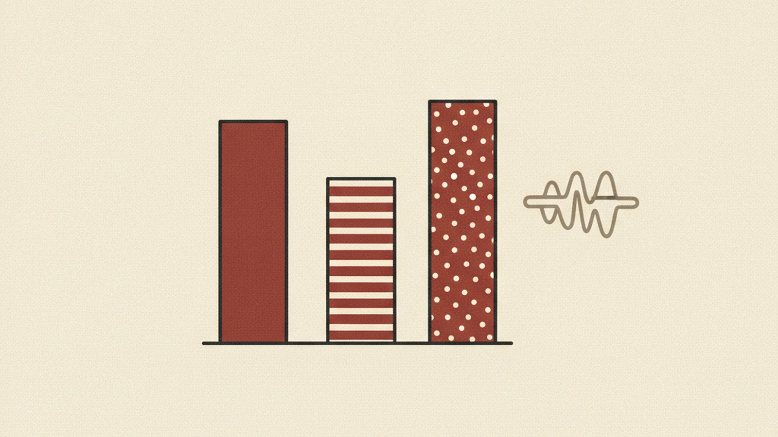
The fix is genuinely simple: give each series a distinct shape (dashed vs. solid vs. dotted lines, different marker icons), or label lines directly at their endpoint instead of relying purely on a color-coded legend. Color becomes a nice-to-have reinforcement instead of the only signal.
The Stat: roughly 1 in 12 men and 1 in 200 women have some form of color vision deficiency, meaning a color-only legend silently excludes a real, sizable share of any dashboard's audience — not a rare edge case. (source: World Health Organization / general color vision deficiency prevalence data)
Interactive Charts Need a Keyboard, Too
Modern dashboards aren't static images — they're interactive. Hover for a tooltip. Click a legend item to toggle a series. Drill into a bar to see the underlying rows. All of that interactivity needs to work without a mouse, per 2.1.1 Keyboard (Level A).
A tooltip that only fires on mouseenter, with no keyboard-triggered equivalent, is invisible to a keyboard-only user by definition — there's no mouse event for them to trigger. Same with a legend toggle that's a <div> with a click handler and no tabindex, no focus state, no Enter/Space handling. It looks interactive. It functions like a picture of a button.
The practical test is simple: unplug your mouse, tab through the chart, and try to reach every interactive piece — tooltips, legend toggles, drill-downs — using only the keyboard. If you can't get somewhere with Tab and trigger it with Enter or Space, neither can a keyboard-only user.
Contrast Doesn't Stop at Body Text
Sufficient contrast applies to chart elements too, not just paragraphs. Thin chart lines, small data-point markers, gridlines, and axis labels need to meet 1.4.11 Non-text Contrast (Level AA) — a 3:1 minimum ratio against their background.
This is exactly the kind of detail that gets lost in a slick, low-contrast dashboard aesthetic. Pale gray axis labels on a white card. Hairline gridlines barely darker than the background. A data-point marker rendered in a soft pastel that looks lovely in the design file and nearly vanishes on an actual monitor in daylight. None of it registers as "broken" in a design review — it just quietly fails the moment someone actually needs to read it.
What "Accessible By Default" Looks Like
Do This / Not This: Building Charts That Actually Communicate
| Chart Element | Not This | Do This |
|---|---|---|
| Data access | Chart is the only place the data exists | Adjacent data table or text summary conveys the same values |
| Series distinction | Color-coded lines/bars only | Distinct shapes, patterns, or direct labels plus color |
| Tooltips | Mouse-hover only, no keyboard trigger | Keyboard-focusable trigger with visible focus state |
| Legend toggles | Click-only <div>, no focus/keyboard support |
Real button/checkbox markup, fully keyboard-operable |
| Line/marker contrast | Pale, thin lines under 3:1 against background | Lines and markers meet 3:1 non-text contrast (1.4.11) |
| Chart summary | No takeaway text anywhere | One-sentence plain-language summary of the key insight |
Build the Habit In, Not On
The teams that get this right don't treat accessibility as a post-launch audit item for their dashboards — they build it into the default chart component so every new chart inherits it. Every chart gets a text-equivalent by default: a nearby data table or a written summary, no exceptions. Every color palette gets shape or pattern backup before it ships. Every interactive element gets a keyboard pass before the pull request merges.
That's the whole discipline, really: assume by default that a chart communicates nothing to a screen reader, nothing to a colorblind viewer relying on color alone, and nothing to a keyboard-only user hovering nothing — and build outward from there until it actually does.
Get Your Reporting UI Checked Before It Ships to a Customer
Dashboards and reporting tools are often the most data-dense, least-reviewed part of a product from an accessibility standpoint — everyone scrutinizes the marketing site, and the internal-feeling analytics view slides through untouched. That's exactly where these gaps live.
If your product has charts, dashboards, or reporting views customers depend on, it's worth knowing exactly where they stand. Get your dashboards and reporting UI audited for accessibility, and find out precisely which charts are silent, which legends rely on color alone, and which interactive elements a keyboard can't reach — before a customer or an auditor finds out first.