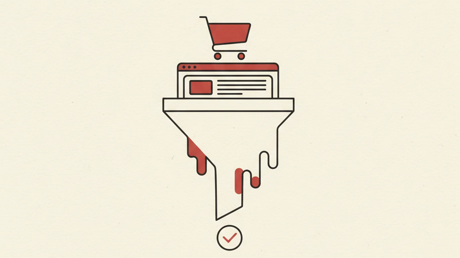
Most accessibility conversations about ecommerce start and end at the checkout page, as if that were the only place a sale could quietly die. It is an easy place to focus on. Checkout is where the money changes hands, so it is where teams naturally look first when conversion numbers disappoint.
But by the time a customer even reaches checkout, they have already survived three earlier stages where the sale could have ended without a trace: finding the product, understanding what they were looking at, and putting it in a cart. Any one of those stages can lose a customer with a screen reader, a keyboard, or a voice control tool, and none of it shows up as a support ticket. It shows up as a bounce, a low add-to-cart rate, or an abandoned session with no explanation attached to it.
The Stat: 95.9% of the top one million home pages have detectable WCAG 2 failures, averaging 56 errors per page, failures that sit directly in the path of a purchase, not off to the side. (Source: WebAIM Million, 2026)
The Whole Funnel Leaks, Not Just the Last Mile
We have written before about checkout specifically, in Ecommerce Accessibility: A Checkout That Complies and Converts and The Silent Killer of Conversion: An Inaccessible Checkout. Both are worth reading closely if payment forms are your focus. This piece is deliberately different. It steps back from the last mile and looks at the entire path a customer walks before checkout is even in view, because a broken filter or a silent cart update can end the sale just as completely as a broken payment field, and it tends to happen earlier, with less visibility into why.
Think of each stage of the funnel as a gate. A customer with a disability has to pass through search, the product page, and the cart before checkout gets a chance to lose them too. If any earlier gate is broken, checkout's accessibility never even gets tested, because the customer never arrives.
Stage One: Search and Filters That Only Sighted Users Can Operate
Filter panels are usually the first place a shopper narrows down what they want, by price, size, color, or category. Many of these panels are built as custom widgets, styled divs and spans standing in for checkboxes and buttons, with click handlers attached in JavaScript but no underlying semantics. A mouse user sees a checkbox. A screen reader user hears nothing indicating it is interactive at all, or hears "clickable" with no name describing what it filters.
The fix is not exotic. Native <input type="checkbox"> and <button> elements come with keyboard support and screen reader semantics built in for free. If a custom widget is unavoidable for styling reasons, it needs the correct ARIA role, an accessible name, and a keyboard interaction pattern that matches what the role promises. Result counts that update as filters change also need an aria-live="polite" region, so "42 results" or "0 results" gets announced instead of only changing visually.
Stage Two: Product Pages That Sell to the Eye Only
A product page's whole job is to answer "is this the thing I want." For a screen reader user, that answer usually depends on alt text carrying real, distinguishing information: the color, the angle, the detail a photo shows that the title does not already say. "Product image" or a blank alt="" on the hero photo answers nothing.
Two other common failures sit right next to it. Color and size swatches are frequently unlabeled div grids, so a screen reader user hears a row of clickable elements with no indication which one is "Forest Green" versus "Slate." And image carousels often trap keyboard focus or hide their next and previous controls from assistive tech entirely, meaning the shopper cannot even see the second photo, let alone the size chart buried in the fourth one.
None of this requires a redesign. It requires alt text that describes what is actually different about each image, real button elements for swatches with visible, programmatic names, and carousel controls that are reachable and operable by keyboard, in that order of priority.
Stage Three: The Cart That Updates and Says Nothing
The cart stage fails in a very specific way: it works, technically, and says nothing about it. A customer removes an item, changes a quantity, or applies a promo code, and the total updates instantly on screen. A sighted shopper sees the new number. A screen reader user, focus still sitting on the button they just pressed, hears silence. Did the item get removed? Did the code apply? Did anything happen at all?
This is exactly the kind of dynamic update that WCAG's status messages guidance was written for. A cart total, an item count, or a "removed from cart" confirmation needs to be exposed through an aria-live region (or an equivalent role like status or alert) so it is announced without the user having to move focus to go looking for it. Skipping this step does not throw an error. It just leaves the customer unsure whether their own action worked, which is one of the fastest ways to make someone abandon a cart they were seconds from paying for.
Stage Four and Five: Checkout and Confirmation, Briefly
Checkout deserves its own deep dive, and we have already written two: the checkout that complies and converts walks through labeling and error handling in detail, and the seven blockers costing disabled customers breaks down the most common ways forms fail at that stage specifically. Read both before an audit of your payment flow.
What gets missed even by teams who fix checkout is the confirmation page right after it. An order confirmation that loads new content, "Thank you, your order is placed," but never moves focus or announces itself, leaves a screen reader user parked wherever they last were, with no signal the purchase actually went through. Some will hit submit again out of uncertainty, risking a duplicate charge. Moving focus to a confirmation heading, or announcing it via a live region, closes the loop the customer opened the moment they clicked "place order."
A Funnel Level Checklist
Run this across the whole path, not just checkout:
- Filter checkboxes and buttons are real form elements or correctly roled, with visible focus and accessible names
- Result counts announce through a live region when filters change
- Every meaningfully different product photo has alt text describing what is different about it
- Color and size selectors are real buttons or inputs with programmatic names, not unlabeled divs
- Carousel and zoom controls are keyboard reachable and do not trap focus
- Cart quantity changes, removals, and promo code results announce through a live region or status role
- Checkout errors are identified in text, associated with their field, and announced, not conveyed by color alone
- The confirmation page moves focus or announces itself so the customer knows the order went through
Why This Is a Revenue Problem, Not Just a Legal One
It is worth saying plainly: none of the mistakes above are rare edge cases affecting a handful of sites. As the number above shows, the overwhelming majority of the web's most visited home pages carry detectable WCAG failures, and ecommerce funnels are built from exactly the kinds of components, forms, dynamic updates, custom widgets, that generate those failures. WebAIM's own audit data backs this up at scale, and the W3C's business case for accessibility makes the same point from the revenue side rather than the compliance side: accessible design tends to widen the top of the funnel and reduce drop-off throughout it, for reasons that have nothing to do with lawsuits.
Every barrier in this article behaves like an unintentional experiment that always favors the same outcome: the customer leaves, and nobody on the team sees why. Treating accessibility as a full funnel, conversion rate concern, rather than a checkout only compliance task, is how that experiment stops running silently in the background. If you want a second set of eyes on where your own funnel is leaking, our ecommerce accessibility work starts with exactly that question: where, before checkout, are you already losing the sale.
If you would rather talk it through with a person first, reach the team directly at experts@wcag.world, or take a look at our ecommerce accessibility solutions to see where a full funnel review would start.