Three Taps and He's Gone
He has a tremor-related motor impairment. Nothing that stops him from shopping online — he does it all the time, on his phone, one-handed, thumb doing the work. He fills a cart, gets to checkout, and decides to remove one item.
The delete icon sits eighteen pixels wide, wedged tight between an edit icon and a quantity stepper. His thumb isn't steady enough to land on an eighteen-pixel target without overshoot. First tap hits the quantity stepper and bumps his order up by one. Second tap hits the edit icon and opens a modal he didn't want. Third tap, finally close, still misses.
He closes the app. Not because the product was wrong, or the price was wrong, but because a row of icons was built for a mouse cursor and never once tested against a thumb, a tremor, or a screen that doesn't forgive a two-pixel miss. The order — and the revenue — just walked away.
This is the single most common accessibility failure on mobile web and hybrid apps today, and it has a precise, testable fix.
The Rule: WCAG 2.5.8 Target Size (Minimum)
WCAG 2.2 introduced 2.5.8 Target Size (Minimum), a Level AA success criterion, specifically because failures like the one above were so widespread. It requires that the size of the target for pointer inputs be at least 24 by 24 CSS pixels — with three defined exceptions.
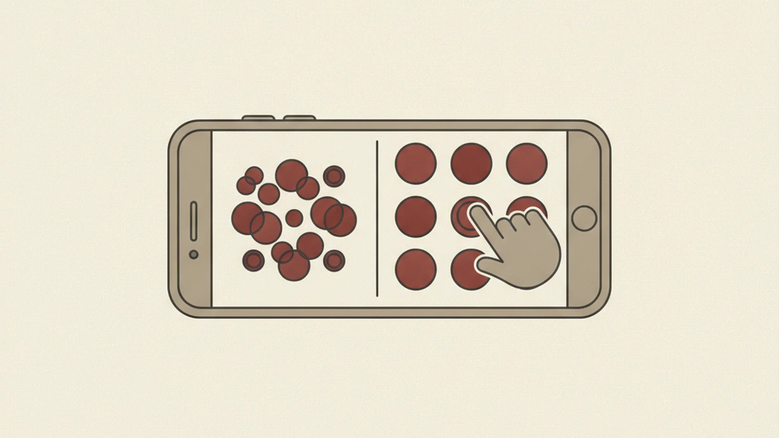
Exception 1: Spacing. A target smaller than 24x24px can still pass if it has enough surrounding space that a 24x24px circle centered on the target doesn't overlap the circle of any adjacent target. In other words, a small icon is fine as long as nothing else is close enough to compete for the tap.
Exception 2: Inline text links. A link sitting inside a sentence of body text — "click here to continue" — is exempt. You can't reasonably inflate a single word in a paragraph to 24px tall without wrecking the typography.
Exception 3: Native controls. If the target is part of a control the user agent renders itself — a native <input type="checkbox"> styled by the OS, for instance — the exemption applies, because the platform, not your CSS, owns the rendering.
Outside those three cases, 24x24px is the floor. Not a suggestion, not a nice-to-have — the minimum bar for Level AA conformance.
The Gold Standard Most Teams Should Actually Build To
24x24px is the legal minimum. It is not the target you should be designing for. 2.5.5 Target Size (Enhanced), a Level AAA success criterion, sets a stricter 44 by 44 CSS pixel minimum — and that number isn't arbitrary. It matches both Apple's Human Interface Guidelines and Google's Material Design guidance for comfortable touch targets.
Here's the practical takeaway: if your design system already follows Apple's or Google's own platform conventions, you're very likely already at or near 44x44px, and you're clearing the AA minimum with room to spare. If your design system was built by eyeballing icon sizes against a desktop mockup and shrinking everything to "look clean" on a small screen, you're probably under 24px in several places — and that eighteen-pixel delete icon in the story above is exactly what that looks like in production.
Treat 44x44px as the working standard, and 24x24px as the wall you never want to be found on the wrong side of.
Why Icon Bars Fail Even When Every Icon Is "Technically" 24px
This is the trap that catches teams who think they've already solved the problem. A designer sizes every icon in a bottom nav bar to exactly 24x24px, ships it, and assumes 2.5.8 is satisfied.
It often isn't — because the criterion isn't just about the icon's own size. It's about whether adjacent targets crowd each other. An icon-only nav bar with icons packed edge-to-edge, with zero spacing between them, fails 2.5.8 even at exactly 24x24px, because there's no buffer left for the spacing exception, and the icons themselves are sitting at the bare minimum with no room for a real-world thumb, which is wider and less precise than a mouse cursor.
The fix isn't complicated: add visible or invisible padding around each tappable icon so the effective tap area — not just the visible icon — clears 24px with breathing room, and keep enough gap between neighboring icons that a slightly-off tap doesn't land on the wrong one.
Swipe Gestures: The Feature That Quietly Locks People Out
"Swipe to delete" and "swipe to reveal" are everywhere in mobile UI, and they're a usability failure the moment they're the only way to trigger the action. This connects to 2.5.7 Dragging Movements, a related WCAG 2.2 criterion: if a function can be done with a drag or swipe gesture, there must also be a way to do it with a single tap.
Think back to the checkout example. If the only way to remove a cart item were a swipe gesture instead of a tiny icon, the outcome would be identical — a user with a motor impairment, or simply someone holding a phone one-handed on a crowded train, physically cannot execute a precise directional swipe any more reliably than a precise tap. The rule isn't "don't use swipe gestures." It's "don't make swipe the only path." A visible delete button alongside the swipe action satisfies both the power users who like the gesture and everyone else who needs a dependable alternative.
Zoom In and the Page Falls Apart Sideways
Touch targets aren't the only way mobile accessibility breaks down. 1.4.10 Reflow, a Level AA criterion, requires that content displayed at a 320 CSS-pixel-wide viewport — equivalent to a typical phone screen, or a desktop browser zoomed to 400% — can be used without needing to scroll in two directions at once. Vertical scrolling is expected and fine. Horizontal scrolling just to read a single line of text is a failure. (Content that genuinely needs two dimensions — a data table, a large image, a map — is exempt.)
The most common way this breaks on mobile isn't a rogue <table>. It's sticky headers and footers. A fixed-position header, footer, or persistent bottom nav eats a fixed slice of vertical screen real estate. That slice doesn't shrink when a user zooms to 400% — it stays exactly as tall, in pixels, as it was before. The content underneath it does shrink relatively, and at extreme zoom the sticky element can end up covering so much of the viewport that what remains has to be reached by scrolling sideways, or is pushed fully out of reach. A page that looks perfectly reasonable at 100% zoom can become functionally unusable at 400% purely because of one position: fixed header nobody re-tested after zooming.
Locked to One Orientation, Locked Out of the App
1.3.4 Orientation, a Level AA criterion, requires that content and functionality not be restricted to a single display orientation — portrait-only or landscape-only — unless a specific orientation is essential to the function itself. A piano-keyboard app that only makes sense in landscape, or a check-deposit camera capture flow that requires a specific orientation to align the shot, are legitimate exceptions. A checkout form, a settings screen, or a content feed locked to portrait for no functional reason is not. Users with a phone mounted on a wheelchair, a tripod, or a fixed stand don't always get to choose their orientation, and the app shouldn't assume they can.
Why This All Comes Back to the Same Underlying Fix
Here's the connective thread across every criterion above: mobile accessibility depends heavily on using the platform correctly. iOS VoiceOver and Android TalkBack both build their accessibility tree from semantic HTML and ARIA roles — real buttons, real labels, real headings, in the DOM, not <div> soup with click handlers bolted on. The same "use real buttons, real labels, real headings" guidance that applies to desktop accessibility carries over directly to mobile web and hybrid apps. Get the semantics right, and touch target sizing, focus handling, and screen-reader labeling all get dramatically easier to fix consistently, because you're not fighting custom components that were never wired into the accessibility tree in the first place.
Test It Yourself in Ten Minutes
You don't need a lab to catch most of what's described here. Try this on your own app or site right now:
- Turn on your phone's OS-level accessibility text-size setting and bump it up several notches.
- Enable browser or system zoom and push it toward 400%.
- Attempt your core conversion flow — checkout, signup, booking — one-handed, using a single thumb.
- Note every tap that misses, every element that disappears behind a sticky header, and every gesture that has no tap-based alternative.
Most touch-target and reflow failures surface within the first few taps of this test. That's not a coincidence — it's because these failures live in the exact flows your revenue depends on.
The Bottom Line
Touch target sizing isn't a cosmetic detail buried in a spec document. WCAG 2.5.8 sets a 24x24px legal floor at Level AA, 2.5.5 sets a 44x44px best-practice ceiling at Level AAA, and the criteria around reflow, dragging, and orientation all point at the same real-world outcome: a mobile interface that a person with a tremor, a person holding a phone one-handed, or a person zoomed in at 400% can actually complete a purchase on.
The man in the checkout story didn't fail. An eighteen-pixel icon with no spacing failed him. That's a fixable design decision, not an unavoidable limitation — and it's usually one of the fastest wins in a mobile accessibility audit.
If you want every tap target, gesture, and zoom state in your mobile flows checked against 2.5.8, 2.5.5, 1.4.10, 1.3.4, and the platform accessibility APIs underneath them, see our pricing and get started.