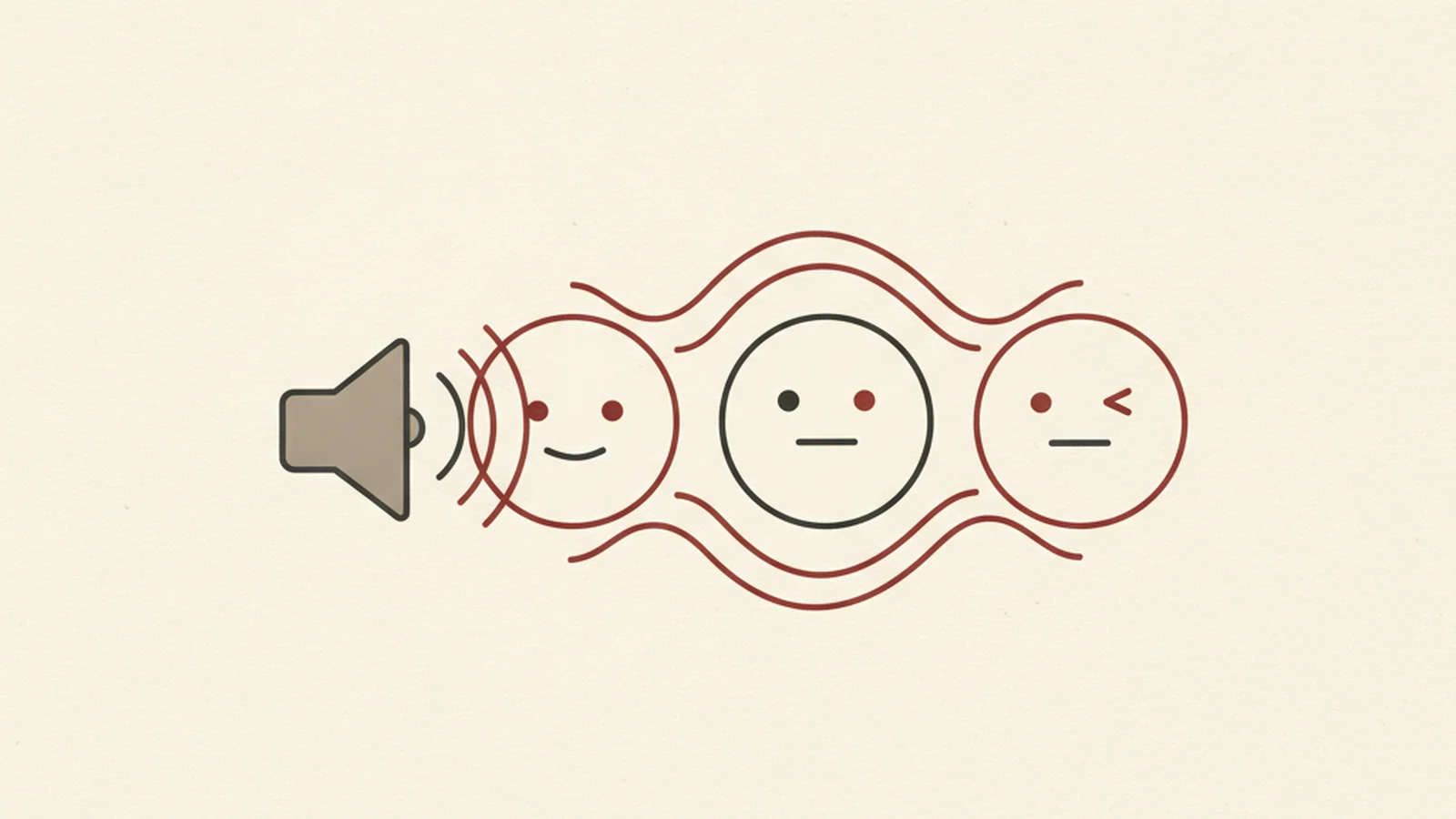
Go on, say "party popper" out loud five times in a row. Now imagine someone did that to you unprompted, at the top of a sentence, before you had any idea what the sentence was about. That's the actual listening experience for a screen reader user every time your caption opens with 🎉🎉🎉🎉🎉.
Here's the good news: fixing this is one of the fastest, cheapest accessibility wins available to anyone who writes captions, posts, emails, or push notifications. You don't need a developer, a ticket in the backlog, or a budget line. You just need to know what's actually happening under the hood — and then break a handful of habits you probably picked up without thinking.
The Stat: Screen readers announce Unicode's official character name for each emoji encountered. The emoji 🎉 (U+1F389) has the official Unicode name "PARTY POPPER" — that's the exact phrase a screen reader speaks aloud every time it appears, no matter how you intended it. (Source: Unicode Consortium)
How screen readers actually "hear" an emoji
An emoji isn't a picture to assistive technology — it's a character, same as the letter "A." Every emoji has an entry in Unicode's official full emoji list, and that entry includes a formal name. Screen readers, following guidance laid out by groups like W3C WAI, pull that name (via CLDR emoji annotations) and speak it exactly as written whenever the character shows up in text — a heading, a caption, a button, an alt attribute, all of it.
This is why 🎉 doesn't get skipped over as "a fun little sparkle sound" the way your eye processes it visually. It gets announced as "party popper." Full stop, said out loud, every time, in the middle of whatever sentence you dropped it into. Multiply that by five emoji in a row and you've built a sentence that's technically readable but practically unlistenable — the auditory equivalent of a wall of exclamation points.
None of this makes emoji off-limits. Used with intention, they add warmth and personality, and plenty of screen reader users enjoy them too. The problem isn't emoji — it's emoji used the way most of us learned to use them: stacked for emphasis, dropped at the front of sentences for visual pop, or substituted entirely for words we were too rushed to type.
It also helps to remember that "screen reader user" isn't one monolithic experience. Some people listen at a measured, conversational pace; plenty of experienced users crank the speech rate up to two or three times normal speed, skimming audio the way a sighted reader skims a page. At that speed, a string of five identical emoji names doesn't even register as five distinct words — it registers as a stutter, a glitch, a reason to second-guess whether the content loaded correctly. You're not just adding friction for slow, careful listening; you're actively breaking the fast-skim experience that power users rely on every day.
Why this is different from "just being extra"
It's tempting to file emoji habits under "nice to have" rather than "accessibility issue," but the mechanics here are identical to any other accessibility failure: content that's technically present but functionally unusable for a specific group of people. A sighted reader's eye glides past a row of party popper emoji in about a quarter of a second, registering "celebration" as a vibe rather than five discrete announcements. A screen reader has no equivalent shortcut — it reads what's there, literally, in order, every time. There's no "vibe mode." That gap between how something looks and how it sounds is exactly the kind of thing that gets missed in a visual design review and only surfaces once someone actually listens.
The five habits that are quietly wrecking your posts
Here's what each of those checklist items above actually sounds like on the other end, and why it matters.
Stacking emoji for emphasis. A caption that opens "🎉🎉🎉 We're hiring!" reads as "party popper party popper party popper We're hiring." One well-placed emoji lands. Five in a row is just noise repeated on a loop before the actual message even starts.
Leading with an emoji. Starting a sentence with an emoji forces the listener to sit through the announcement before they get any context for why it's there. Put the emoji at the end, where it functions like a tone indicator after the point has already been made — "We're hiring! 🎉" reads far more naturally.
Using emoji as the entire label on a heading or button. If a button's only content is 📤, a screen reader announces "outbound tray" (or a similarly literal Unicode description) with zero indication that it means "Share." Buttons and headings need real text labels; an emoji can sit alongside that text, never replace it.
Describing decorative emoji in alt text. If an emoji already sits in your visible text, don't also describe it in an image's alt attribute — that's a redundant announcement stacked on top of one that already happened. Decorative or repeated emoji shouldn't be narrated twice.
Never testing your own copy out loud. This is the cheapest fix on the list and the most skipped. Turn on your phone's built-in screen reader — VoiceOver on iOS, TalkBack on Android — and let it read your draft before you hit publish. You will hear the problems immediately; most people don't need a guide after doing this once.
What screen reader users are actually hearing vs. what you meant
| What you typed | What a screen reader user hears | Why it's a problem |
|---|---|---|
| "🎉🎉🎉 We're live!" | "party popper party popper party popper We're live" | Repetition front-loaded before any content |
| "😂😂 can't stop laughing" | "face with tears of joy face with tears of joy can't stop laughing" | Same emoji announced twice, no added meaning |
| Button labeled only "❤️" | "red heart" (no indication it means "Like" or "Save") | No actual instruction for what the control does |
| Alt text: "photo of cake 🎂" | Cake described, then "birthday cake" announced again from the emoji | Double narration of the same object |
Quick wins you can ship today
You don't need a style guide overhaul. Start with these:
- Cap yourself at one emoji per sentence, placed at the end, not the start.
- Never let an emoji be the only content of a link, button, or heading — pair it with real text.
- Drop decorative emoji from alt text if they already appear in the visible caption.
- Before publishing anything emoji-heavy, run it through your phone's screen reader once. It takes fifteen seconds and catches nearly everything above.
- When in doubt about how an emoji will be announced, check its listing on Unicode's official chart rather than guessing from how it looks.
Organizations like WebAIM have spent years documenting exactly this kind of everyday, low-effort accessibility friction — the stuff that never shows up in a design review but shapes whether real people can actually use what you publish. Emoji habits are a perfect example: nobody sets out to make content harder to hear, it just accumulates one stacked celebration emoji at a time, one hurried social post after another.
The fix doesn't require a policy document or a training deck. It requires the same five-second gut check every time you're about to hit publish: would this sentence still make sense, and still sound pleasant, if every emoji in it were replaced with its literal name read aloud? If the answer is no, trim it before it ships, not after someone points it out.
Content habits like these are an easy, high-leverage place to start, but they're only one slice of what makes a site or a brand's output genuinely accessible. If you want to know where the bigger gaps are — the ones living in your actual website, not just your captions — you can get a free scan of your site's accessibility and see exactly what needs attention next.