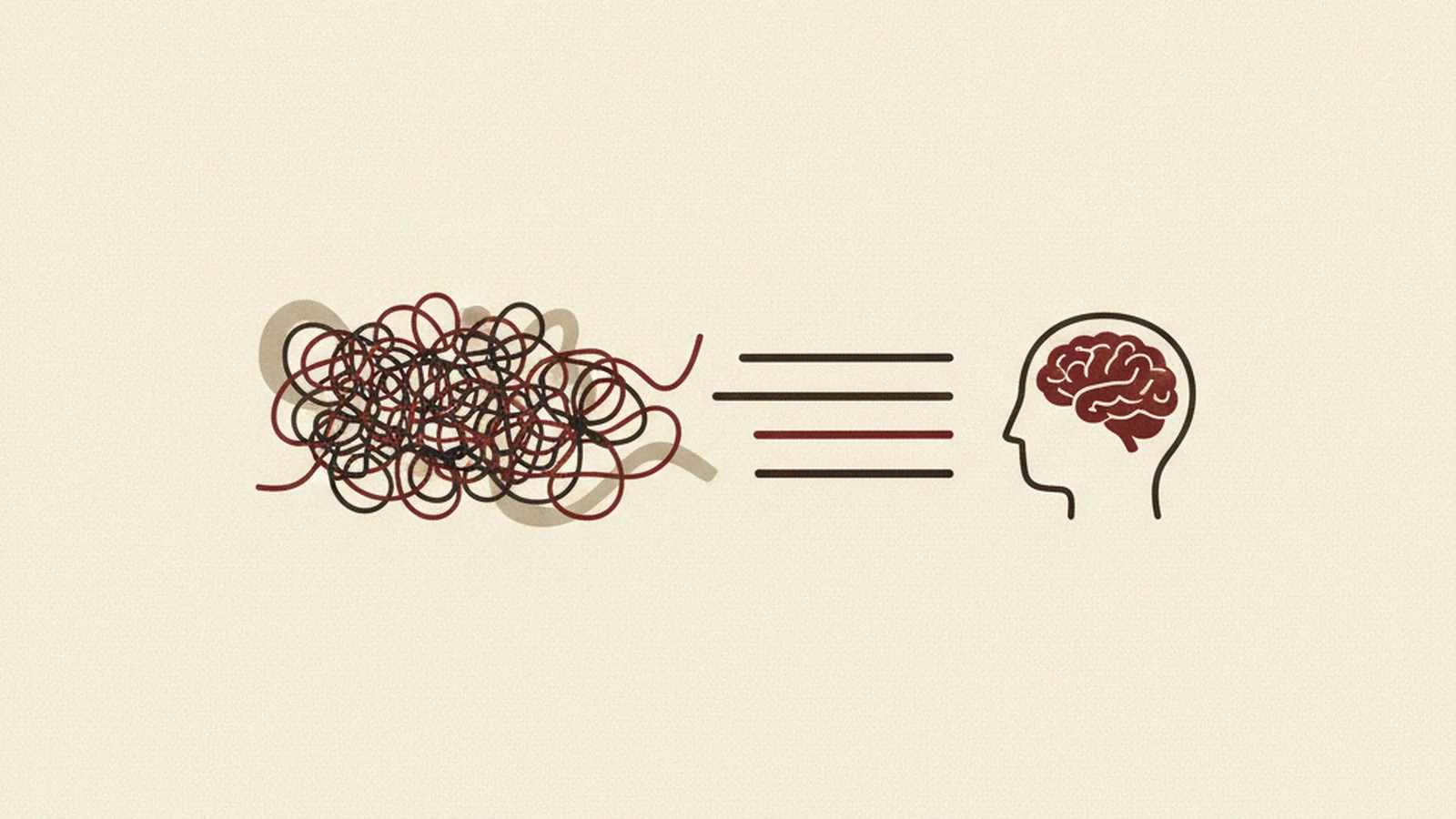
The Cancellation Flow That Wouldn't Let Him Leave
Daniel is eight months out from a traumatic brain injury. His speech is back, his job is back, most of his life is back. What hasn't fully come back yet is his working memory — the ability to hold three or four things in his head at once while he does something else with them.
Today he's trying to cancel a subscription he no longer uses. He clicks "manage subscription." A screen appears offering him 40% off if he stays. He clicks "no thanks, cancel." A second screen appears offering him a different plan at a lower tier. He clicks past that too. A third screen asks him to confirm by solving a CAPTCHA — a grid of distorted letters he has to read and retype exactly, with no audio option and no way to just call someone instead.
By this point, Daniel isn't tracking three offers and a puzzle. He's tracking nothing. He's forgotten which button he clicked on the second screen, whether the retype was case-sensitive, and honestly, what he was even doing five minutes ago. He closes the tab. The subscription renews.
Nothing here was illegal in the way a missing alt tag is illegal. But it's a textbook failure of cognitive accessibility — and it's the exact category of problem that most WCAG audits still don't catch, because until recently, WCAG itself didn't have much language to catch it with.
Why This Gap Exists
WCAG has always had a strong, mature toolkit for visual disabilities (contrast, alt text, resizable text) and motor disabilities (keyboard access, target size, timing). Cognitive, learning, and neurological disabilities — memory impairments, attention disorders, dyslexia, brain injury, intellectual disabilities — have historically had far fewer success criteria written specifically for them.
This isn't a secret. The W3C's own Cognitive and Learning Disabilities Accessibility Task Force, known as COGA, has spent years documenting the gap and pushing for criteria that actually address it. WCAG 2.2 is the first version where that work shows up as real, testable rules rather than just guidance documents. If your last audit was scoped purely to 2.1, there's a good chance nobody checked any of this.
The New Criteria That Target Cognitive Load
3.3.8 Accessible Authentication (Minimum) — Level AA
This is the one Daniel's CAPTCHA screen violates. Under 3.3.8, a login or authentication process cannot rely solely on what WCAG calls a "cognitive function test" — solving a puzzle, remembering and transcribing a code, doing basic math in your head — unless one of two things is also true: there's an alternative method available (password manager compatibility, a "remember me" mechanism, an email-link login), or the site offers assistance to complete the test.
The everyday version of this failure isn't dramatic. It's a login form that blocks autofill so users are forced to retype a password from memory. It's a two-factor code sent to a device the user has to read, hold in their head, and switch apps to retype, with no copy-paste allowed. Each of these looks like ordinary friction to a designer. To someone with a memory-affecting condition, it's a wall.
The fix is usually not a redesign — it's removing a restriction. Let password managers autofill. Support copy-paste on OTP fields. Offer a magic-link login as an alternative to a typed password. None of this weakens security; if anything, password managers tend to produce stronger, more unique passwords than anything a user types from memory.
3.2.6 Consistent Help — Level A
If your site has a help mechanism anywhere — a chat widget, a "Contact us" link, a link to an FAQ, a support phone number — it has to show up in the same relative position across every page it appears on. Not identical pixel coordinates, but the same relative order among the other elements on the page.
Think about what this protects against: a user who's already anxious or struggling finds the chat bubble in the bottom-right corner on your homepage. Two pages later, mid-task, they need help again — but on this page the same widget has moved to the top of a sidebar, or vanished into a footer. They've now lost the one thing they'd already located. For someone who has to work hard to build a mental map of an interface in the first place, that's not a minor inconsistency. It's the map being wrong.
3.3.7 Redundant Entry — Level A
This one is almost embarrassingly simple once you see it: don't make people re-enter information they already gave you in the same process. A shipping address typed on step one shouldn't have to be retyped as a billing address on step three unless the user says they're different. A name entered during signup shouldn't need to be typed again during checkout five minutes later.
Every unnecessary re-entry is a small memory test — did I already type this? What did I type? Is it the same field? — stacked on top of whatever else the user is trying to accomplish. Cut it and you cut real cognitive load, not just keystrokes.
Reading Level and the Practice of Plain Language
3.1.5 Reading Level is a Level AAA criterion, and it's a genuinely hard one: it asks that content not require reading ability beyond a lower-secondary education level, or that a simplified supplemental version be available. For a marketing site, that's realistic. For a page explaining tax law, medical procedures, or a legal contract, it often isn't — and WCAG itself acknowledges this is one of the harder AAA criteria to fully satisfy for complex or technical content.
Here's the distinction worth holding onto: even organizations that will never formally claim AAA reading-level conformance should still run a plain-language pass on their content, because the practice of plain language pays off at any conformance level. That means:
- Defining jargon the first time it's used instead of assuming familiarity
- Preferring short, direct sentences over dense, clause-stacked ones
- Using literal language instead of idioms or figurative phrasing ("get started" over "hit the ground running")
- Labeling multi-step processes clearly, with a visible sense of progress, so users always know where they are and how much is left
None of this requires dumbing content down. It requires being precise instead of impressive.
The Population This Actually Serves
Here's the part that should change how you prioritize this work: cognitive accessibility improvements almost never help only the narrow population they're designed for. A clear multi-step checkout with visible progress helps someone with an attention disorder — and it also helps a tired parent finishing the order at 11pm, a non-native speaker parsing unfamiliar terms, and anyone who's simply stressed and distracted, which is most people, most of the time. Consistent help placement (3.2.6) and consistent navigation (3.2.3, Level AA) both work the same way: predictability is a universal good, not a niche accommodation.
Related patterns worth checking alongside all of this: 2.2.1 Timing Adjustable requires that users be able to turn off, adjust, or extend time limits, with narrow exceptions like real-time auctions — a session timeout that logs someone out mid-form with no warning fails this the same way Daniel's CAPTCHA screen failed 3.3.8.
A Practical Starting Checklist
If you want to know where you actually stand, start here:
- Audit your login/authentication flow. Is there any path to log in that doesn't require solving a puzzle, transcribing a code, or doing math — or is one and only one option offered with no alternative?
- Check help-link placement across every page template. Does it hold the same relative position everywhere it appears?
- Review your top conversion flows — signup, checkout, account setup — for any field that re-asks for data already entered earlier in the same session.
- Run key marketing and onboarding copy through a plain-language pass. Cut undefined jargon, idioms, and unnecessarily complex sentence structures.
- Walk your multi-step processes end to end and confirm each step is clearly labeled with visible progress, not just a spinner or a silent redirect.
The Round-Up
WCAG's coverage of cognitive, learning, and neurological disabilities used to be thin — that's not a controversial statement, it's the reason COGA exists. WCAG 2.2 is the first version to put real, testable teeth behind that gap with 3.3.8, 3.2.6, and 3.3.7, and the plain-language practices behind 3.1.5 are worth adopting even where the strict AAA bar isn't the goal.
Most audits still skip this category entirely because it doesn't show up the way a contrast failure or a missing alt tag does — it shows up as a user quietly giving up, three screens deep, the way Daniel did. That's a hard failure to notice from a dashboard and an easy one to fix once you know where to look.
If your last accessibility review never touched your authentication flow, your help-link placement, or your multi-step forms, it didn't cover this category at all. Get a cognitive accessibility review and find out exactly where your flows are quietly losing people who simply ran out of working memory before they ran out of patience.