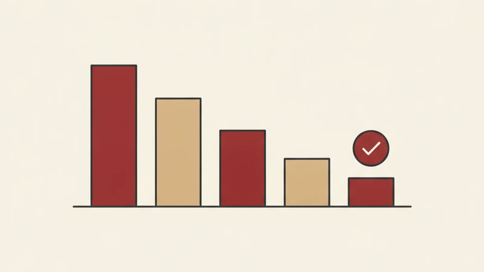
A mid-sized regional law firm, six attorneys, three practice areas, came to us after receiving a demand letter alleging their website was inaccessible to a visitor using a screen reader. It's a common and uncomfortable irony: firms that spend their days on compliance and liability often haven't turned that lens on their own website. Names and identifying details are withheld here at the client's request, but the numbers, the process, and the timeline are real.
Week 0: The audit
We ran a full manual-plus-automated WCAG 2.2 AA review across the firm's marketing site and its client intake form, the two areas named in the letter plus everything adjacent to them. The result: 38 distinct, confirmed failures across 6 WCAG success criteria categories.
The breakdown looked like this:
| Category | Failures found |
|---|---|
| Forms and intake (labels, error handling) | 11 |
| Color contrast | 9 |
| Images and icons (alt text) | 7 |
| Keyboard access and focus order | 6 |
| Headings and page structure | 4 |
| Document/PDF accessibility (retainer forms) | 1 |
Two findings were serious enough to flag immediately: the client intake form had no programmatic labels on any field, meaning a screen reader user could not tell what information was being requested in most fields, and the "Practice Areas" dropdown menu was a custom-built widget that could not be operated with a keyboard at all.
Week 1: Fixing the blockers
We prioritized by severity and reach, not by what was easiest. The intake form and the keyboard-inaccessible dropdown came first, since both directly blocked a visitor from completing the two tasks that mattered most: contacting the firm and understanding what it does.
- The intake form's developer added proper
<label>elements tied to every field, plus visible and programmatic error messages when a required field was left blank, addressing SC 1.3.1 and SC 3.3.1. - The custom practice-areas dropdown was rebuilt using a standard, tested pattern from the ARIA Authoring Practices Guide instead of the original custom build, restoring full keyboard operability per SC 2.1.1.
By the end of week 1, open findings had dropped from 38 to 22.
Week 2: Contrast, alt text, and structure
With the two blocking issues resolved, the team worked through the remaining categories in batches:
- Nine low-contrast findings were resolved by adjusting two shades in the firm's brand palette that fell just under the 4.5:1 ratio required by SC 1.4.3, a change small enough that the firm's designer approved it in one review cycle.
- Seven images, headshots, firm logos, and practice-area icons, received real, specific alt text in place of blank or filename-based attributes.
- Heading structure was corrected across four pages where
<h3>tags had been used purely for font size, restoring a logical outline for screen reader navigation.
By the end of week 2: 9 open findings remained, all of them minor.
Week 3: Cleanup and verification
The final week closed out the remaining findings, including a downloadable retainer agreement PDF that had never been tagged for accessibility, and ended with a full re-audit: manual keyboard pass, screen reader pass with NVDA and VoiceOver, and a re-run of the original automated scan.
Result: zero open WCAG 2.2 AA findings, confirmed by independent re-test, not just a clean automated scan.
What made the timeline realistic
Three weeks is fast for 38 findings, and it worked because of two decisions made in week 0, not because the fixes themselves were trivial:
- Findings were prioritized by user impact, not by file location. The intake form and the keyboard trap were fixed first because they blocked the two actions a prospective client most needs to complete, even though they weren't the largest category by count.
- One developer owned the whole remediation, working from a single prioritized list, rather than spreading small fixes across the team's existing sprint backlog where they compete with client work indefinitely.
What the firm did after the demand letter was resolved
Reaching zero open findings closed out the immediate legal exposure, but the firm made two changes to avoid landing back in the same position:
- The intake form and dropdown pattern became reference components. Instead of treating the fixes as one-off patches, the firm's developer documented the accessible versions of both and reused them across every new page and microsite the firm has launched since, rather than rebuilding a plain
<div>dropdown from scratch each time. - A quarterly automated scan was added to the firm's maintenance contract. It won't catch everything a manual audit would, but it flags the most common regressions, like a new blog post with missing alt text or a new form field with no label, before they accumulate into another 38-item list.
Neither change required new headcount. Both came out of treating the audit's fixes as a pattern to keep, not a one-time cleanup.
If your firm hasn't checked this yet
Law firms are frequent targets for accessibility demand letters, in part because plaintiffs' counsel know the audience is unusually aware of legal risk. If you want the sector-specific rundown, we cover the most common gaps in law firm website accessibility and in client portal and e-signature accessibility, and our law firm solutions page outlines the full remediation path.
The firm in this case study found out what was wrong after a demand letter arrived. Book a free accessibility audit and find out before one does.